
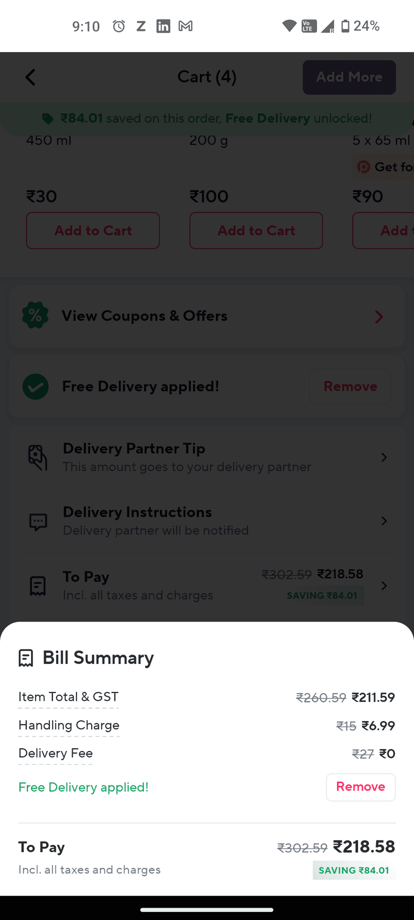
Zepto weird (smart) UX
So zepto has a 'Remove' delivery button inside the bill details. This is a very smart way to make money, since this button is situated inside the details part. But on the other hand it feels a bit weird, if I miss opening the details I might have paid 27 rupees more.
What are your thoughts?
One interview, 1000+ job opportunities
Take a 10-min AI interview to qualify for numerous real jobs auto-matched to your profile 🔑
How exactly would you have paid 27 more in this situation?

Isn't this a part of dark web design patterns? many companies do it.

Zepto also recently added zepto passes to orders without consenting consumers. Defo dark web design patterns

This is a very unethical dark pattern. Forces users to pay more than what is required. And hiding it inside the pay details is even more dark.

This is a good example of dark patterns in design. Thank you!

See dark patterns in UX