
Uber dark UX pattern
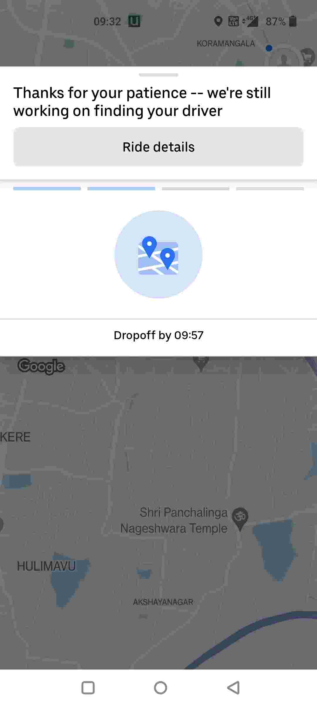
Uber designers (or PMs) why are you trying to get rid of the ride search cancel button? Found a ride faster and cheaper ride on Namma Yatri but can't cancel until Uber decides it's ok to do so!
Won't be surprised if this leads to accidental bookings and shifting the onus on the rider to pay a "cancellation" fee.
Why chase vanity metrics at the expense of the user experience? Switchers gonna switch.

Uber has already added enough friction to ride cancellation flow. This is on another level 😤

You can click on Ride Details button given on the screenshot. They have hidden the ride cancel button underneath there
Adding on to this, Zomato recently made it more difficult to see the breakup of the order amount as you have to scroll down to the bottom & then click on the total to see the full breakup. Why do PMs take such decisions or is it the pressure of management that forces them to make such changes?
Usually happens when decisions are not challenged enough or over indexed on data at the expense of user experience
These kind of decisions really make me question the future of my profession.
- Apps using dark patterns to make life miserable for users. But they continue to make money
- Management forcing their decisions on designers and PMs to add shitty features


I hate Rapido for their really shitty dark patterns when you try to cancel a ride
Did not expect Uber to do this too :/


It's under ride details now
Reason is the spot you see below is now up for advertisement and shows an advertisement when there is one and keeping the button there is then not possible so it's inside now where you see all the ride details and payment stuff and there you can cancel it too
It just logically made sense to put all ride stuff together
So ad revenue >> user experience.
It's inside the Ride Details button. Sadly the button too visually looks like as if it's inactive and non clickable. This looks so intentionally done.

I just close the app

