Designers of Grapevine, can you explain the philosophy/ thought process behind PhonePe's new UI ?
I'd like to see a dark mode of the app. But I'm personally liking the light mode. It feels fresh.
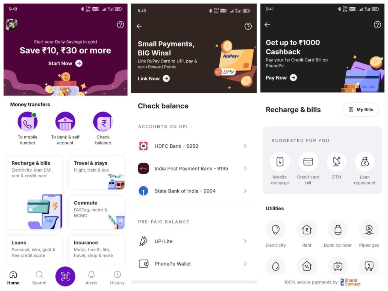
You're right the bigger tiles may seem like a waste of space, but I won't complain since the previous version was extremely difficult to navigate and very cluttered.
This places the most important things at the forefront for me me: Recharge, bills, send money, check balance.
One more thing I agree with is how you need to scroll to find your upi id or access it via profile, they could have fit it within the top.
I also feel like I remember the quick access to frequently paid bills on my homescreen, but maybe that appears once I actually pay bills again? I don't know, unless you can confirm.
I'm still going to give them props for this upgrade, since it solves many of the problems i struggled with as a user. The challenge with designing large scale products like this, is it takes constant testing, feedback and iteration to get things right. This is only first version of this revamp so we can only hope things get better.
They've got a new design system, new visual language, and will definitely most likely be adding to what they already have

